I'm not trying to scare you with the charts in today's issue.
But if you're invested in the market – whether you're a buy-and-hold investor, an active trader, or have any type of retirement account – you need to be aware of where we are in this economic cycle.
You need to prepare for what's coming...
And to get you ready, I'll let the following charts tell the story for me.
You see, charts are simple. Unlike someone talking on CNBC about the economy, charts aren't biased. They have no hidden agenda... They just show you data over a certain stretch of time.
And if you want to predict what's coming next in the market or the economy, you must know what's happening now.
Today, I've got five charts you need to see...
Chart No. 1 – Do You Owe $50,000?
What would you think if I told you total household debt was at $15.48 trillion right now? Would you be worried?
It sounds like a lot. But figures like these are too big to comprehend.
If I told you $15.48 trillion of household debt is an all-time high, that would also sound bad.
But after inflation and with a growing economy, reaching new highs of total dollars owed doesn't necessarily mean a new high of indebtedness.
The only fair way to look at household debt is to divide it by the population. That way you can get a sense of how debt is growing as the population grows...
And when you look at household debt per capita, you can see we're right at the same level of indebtedness as we were when the last financial crisis struck... So not a record, but not far off from one.
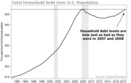
I'll let you be the judge if this should worry you or not. But it certainly scares me.
Chart No. 2 – Unemployment Is 'as Good as It Gets'
I've been on the record multiple times saying that the economy and the stock market won't get rough until the unemployment picture changes.
And yes, the market has been through a couple corrections and has had some volatile days lately, but it hasn't been rough yet. 2008 was rough. 2001 and 2002 were rough. Anyone who had money in the market during those years will agree with me.
The 10%-20% corrections we saw in 2018 are normal.
So I still think this is true: The "big" market downturn won't happen until unemployment starts to reverse course.
But you don't have to take my word for it. You can see below that every time unemployment hits an extreme and starts to rise, the bottom falls out of the market...
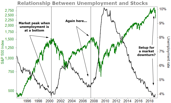
It doesn't take a PhD to see we're at two extremes.
It's entirely possible that unemployment will continue to fall well below 4%. It could go down to 3.5% or 3.4% and stocks could have a couple more years of going higher.
But if that were to happen, unemployment would have to hit a level that it hasn't hit since 1969.
Rather than speculate, let's go to our next chart...
Chart No. 3 – Housing Tells You the Employment Future
How do you find out what's going to happen with unemployment?
What I do is find an indicator that has a track record of tipping off where unemployment is headed. That leads me to look at the relationship between unemployment and the Housing Market Index (HMI).
The HMI measures sentiment for the U.S. single-family housing market. It's a popular gauge of the U.S. housing sector.
The index ranges from 0 to 100. Any reading above 50 indicates the majority of homebuilders view sales conditions as good. As you can see below, when sentiment for housing falls (when the green line goes UP because the index is inverted), unemployment increases shortly after...
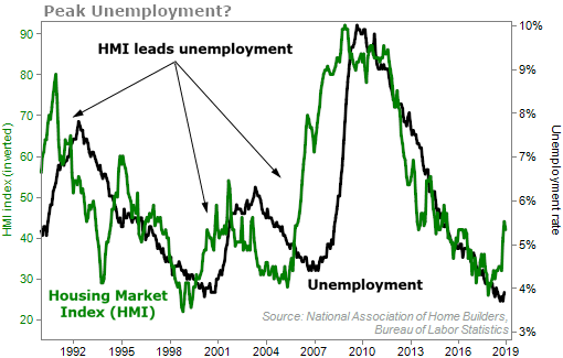
This relationship is clear. And the HMI tends to lead unemployment. When homebuilders lose optimism about selling homes, it's a likely indicator of a weakening labor market.
We've just seen a significant move down in the HMI (the green line going up over the past few weeks). Based on this chart, it could only be a matter of months before unemployment heads higher.
And remember chart No. 2 – if unemployment rises from its bottom, that's not good for stocks.
Chart No. 4 – Strained Corporate Coffers
I've showed you this chart in a previous Health & Wealth Bulletin issue, but it's so important that I want to share it again. I believe corporate debt will be a major reason things could get very ugly for Americans soon. It's easy to tell why...
Corporations have gone on a borrowing spree to capitalize on low interest rates... but it's left them highly leveraged.
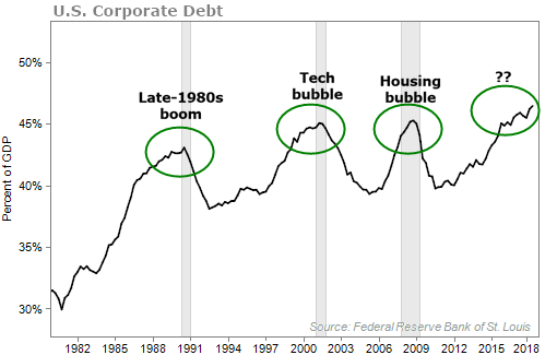
I'll ask you this... How do you think this is going to end?
Chart No. 5 – Finding Wealth Protection
Every chart so far has led me to this last one. And it's the one you probably care about the most... How to make money and preserve your nest egg in any market environment.
The answer is simple...
You need income.
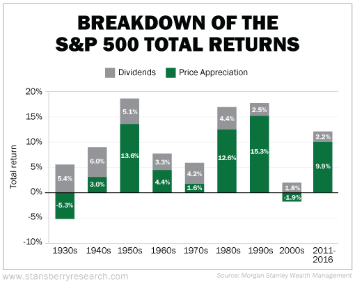
For more than 90 years, dividends were responsible for nearly 40% of the total market return.
As you can see, in decades where major financial crises occurred like the 1930s and 2000s, dividends could have kept your portfolio afloat.
From all the charts I showed you today, it's clear to me the market is headed for a big drawdown sooner rather than later. You'll need income-producing investments if you want to protect your wealth.
You don't need to take my word for it... Just look at how the economy and stocks have behaved in the past and then look at what they're doing today. You can draw your own conclusions.
I talked about market indicators in my recent market briefing, "Why 2019 Could Change the Future of Retirement in America." As the possibility of a big market downturn grows, you'll want to be prepared. Click here to learn more.
What We're Reading...
- Here's what Wall Street is saying about Nvidia's warning.
- Something different: Federal Reserve Chairman Jerome Powell faces a $4 trillion question.
Here's to our health, wealth, and a great retirement,
Dr. David Eifrig and the Health & Wealth Bulletin Research Team
January 30, 2019